6 Tips for Better Title Layouts in PowerPoint
One of the key elements of a business slide
that determines the effectiveness of the message is – the title of the
slide. There are a few things you may
need to keep in mind whenever you create a title for the slide. In this
article, we will explore the points in detail.
1. Let your Title be easy to find
Though this sounds elementary, the number of times presenters make their slide title obscure is unbelievable. Your title should be clear and distinct. The distinction can be achieved by…
- Increasing the font size. If your content is written in a font size of 20 or 22, the title should at least be 36 or 40
- Have a different font for the title. For example, we always have our title in Franklin Gothic Medium Condensed, and the slide text in Calibri
- Draw a line that distinguishes the title area from the content area
- Add a colored band that visually separates the title from the rest of the content
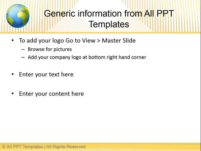
Below is a title layout that follows these principles. The font used is Franklin Gothic Medium Condensed, Title font size is 36 and the colored band separates the title from the content.
 Example Title Layout
It doesn’t matter what technique you use, audience should be able to recognize the title without straining too much.
2. Let your title make an assertion
The title of your slide should make a point. Your body content should provide evidence for the assertion. The evidence could be in the form of a photo, chart, quotation, table, survey results etc. But, the audience should be able to clearly understand what you are trying to arrive at – right at the top of the page.
3. It’s okay for your title to be descriptive
Many presenters make the mistake of assuming that a slide title should be short and telegraphic. Please note - ‘title’ occupies the top 10% of your slide. It is in a font size much bigger than the rest of the content. It is clearly distinct and bold. That means your audience will see your title, even if they don’t see anything else on the slide. Why would you want to waste that precious space with a short, cryptic message? If your slide is a billboard, your title is ‘The message’. Make your point clear, loud and explicit.
4. Don’t use a separate chart title
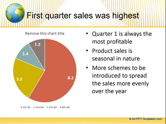
If you are using charts to make your point, make sure that you remove the chart title. Let the slide title be your chart title. Having two titles on a single slide confuses the audience.
 Title Layout for Charts
Source of title templates: 130+ Background Themes pack
5. Let the title style be consistent across slides
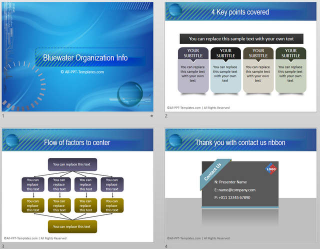
Standardize the title layout – like font type, font size, band color etc. in the Master slide layout. Once done, ensure that you only use slide layout option to enter your title text. Never use a text box to fit in a title. You can’t read that in the slide outline and you can’t edit the title style for the entire presentation easily.
 Example of Consistent Layouts
6. Write your title first and the body content latter
Many times presenters use large diagrams, tables, charts, images etc. on a blank slide and remember the slide title as an afterthought. So, the title gets pushed up, pushed left or sometimes gets shrunk in size totally. That produces inconsistency in the look and feel of the slide set. To avoid that, first write your slide title and then build your body content.
Those are some of the key things you need to keep in mind while writing title for your slides.
Another way to save time:
Writing clear titles is one way to impress your audience. Another way to impress them is to use high quality graphics and diagrams for your slides. However, it takes a lot of time to create professional quality graphics and diagrams from scratch. As a busy business presenter, you may not have the time to create those graphics every time you make a presentation.
That is why we came up with our PowerPoint Background Templates & Themes collection with 130+ themed sets with:
- Background for Title
- Background for Content Layout
- Background for Section Header
- Appropriate color theme.
Why waste time creating your graphics and diagrams from scratch when you have such a high quality solution available off the shelf? Please browse through our diagrams collection and see how the templates can change the way you create your business presentations forever.
I hope you found this tutorial useful. You can find many more such PowerPoint tricks in our tutorials section.
Please do share your comments below if you found this tutorial useful.
Related Posts
Top of Page : Title Layouts in PowerPoint
Main PowerPoint Tutorials Page


