3 Tips for Legible PowerPoint 3D Text
In this article you will learn how to ensure that your PowerPoint 3D text is legible. Usually the text written in a 3D object cannot be read easily. You will find tips below to address this issue.
There is no doubt that 3D effects in PowerPoint help us create visually stunning diagrams. However, sometimes the text written on the shapes as labels is not easy to read for various reasons. In this article, we will explore 3 easy tips to make your text legible even when you apply 3D effects to shapes.
Tip 1: Keep your text flat
Many times we write our text labels right within shapes using ‘Edit text’ option.
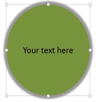
In such cases, the text becomes difficult to read once the 3D perspective effect is applied to the shape.

A simple way to overcome this problem is to check the option called ‘Keep text flat’. You can find this check box under Format Shape > 3D Rotation options. You can see the difference it makes below:
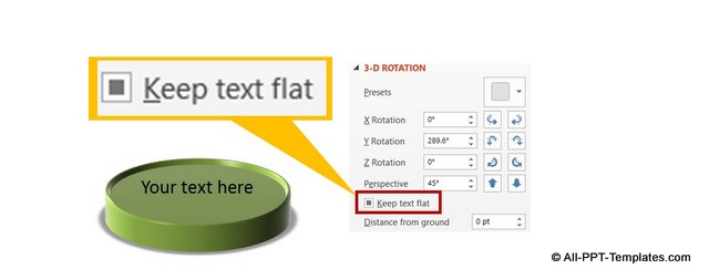
Example of text standing out in 3D shape
In the diagram below, you can see how we create a 3D text standing separately on the 3D object. This ensures that the text is visible.
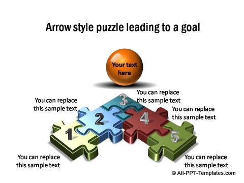
Source: PowerPoint Puzzle from All Inclusive Charts Pack
Tip 2: Change font color as per the material and lighting setting
The font color of text written on a shape may be clearly visible under one ‘Material’ and ‘Lighting’ setting under 3D format options as shown below:
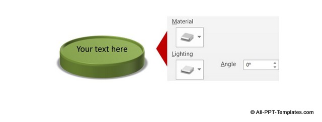
The same text may be hard to read when you change the setting for ‘Material’ and ‘Lighting’ as can you can see in this example:
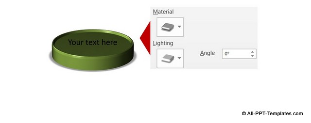
So, make sure that you change the font color to either a lighter or darker version depending on the setting you use for your 3D shapes.
Example of adjusting text for Material & Lighting
In the below example you can see that the background text box and title have a lot of gloss and shine. Given such a background, regular text would be difficult to read. So in the template we have applied shadow effect to text to ensure legibility.
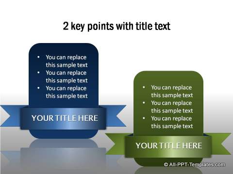
Source: PowerPoint Creative Infographics from All Inclusive Charts Pack
Tip 3: Write the text separately
When you reduce the size of 3D shape, the text may wrap. A part of the text may fall on lighter shades of the shape and a part may fall on the darker shades. This makes it difficult to read the text.
In such cases, it helps to write the label separately using a text box from auto shapes. You can see the difference in the following example:
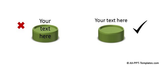
There is no point working on beautifying the diagrams at the expense of the legibility of text. After all, clarity of message is the number one priority for any good business slide.
Example of wrapped text of
In the diagram below you can find the text and title both are in 3D. The text background is kept in lighter color to ensure readability. All text is wrapped and added in a separate text box.
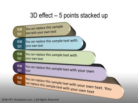
Source: PowerPoint Text and Title templates from All Inclusive Charts Pack
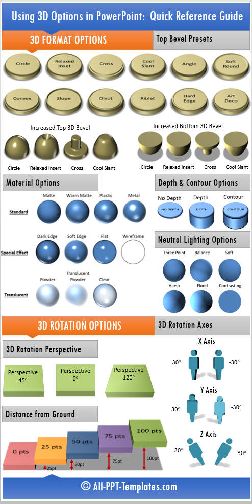
Quick Help Guide Infographic for 3D options in PowerPoint
To make it easy for you to find which 3D option to use when you are creating a 3D diagram in PowerPoint, we'd like to share this useful infographic. It summarizes the contents of the article you have just read and provides a quick reference guide. Just right click on the infographic and Save Image As... to save the helpful guide to your desktop.
Another way to impress your audience:
Using clear and legible text on slides is one way to make your presentation remarkable. The other way to impress business audience is to use high quality charts, graphics and diagrams in your business slides.
However, it takes a lot of time and effort
to create such high quality graphics and diagrams from scratch. That is why we
came up with our All Inclusive PowerPoint
charts collection. All the templates in the pack are
100% editable. Just choose the template that matches your thought and replace
the sample text with your own text. Your business slides get ready in no time. All the example templates showcased above are from the same pack.
Related Posts
Top of Page : PowerPoint 3D Text
Main PowerPoint Tutorials Page
