How To Use Line Spacing to Format Paragraphs
When it comes to the look and feel of PowerPoint slides, many times it is the small things that make a big difference. Very few presenters realize the power of working with ‘Line spacing’ in PowerPoint to format a paragraph.
In this article, you will discover the impact line spacing makes in making your slides look professional.
Improve a bulleted slide with line spacing:
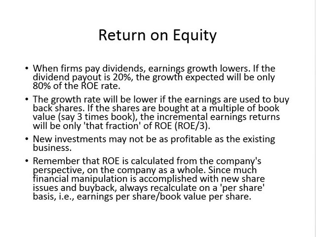
Here is a sample text taken from Wikipedia that talks about ‘Return on Equity’.
[Disclaimer:
First off, we believe that your message gets conveyed much clearer when you use visuals to convey your concepts. We don’t approve of using full sentences as bullets on a PowerPoint slide. However, this article is not about content makeover, but design makeover. We try to show you how you can improve the looks of even the most text heavy slides by working on line spacing.]
The slide looks busy and heavy because the lines in the sentences are packed too tight. You can always improve the readability of the text by increasing the line spacing.
Fonts can make a significant impression in terms of the design quality of any presentation. While there are a number of font options available for use in PowerPoint 2010 and 2013, you may still want to use a special font for its unique appeal.
Wrong way to add line spacing:
Most presenters increase line spacing by going to the preset options in the Home tab under ‘Paragraph’ group.
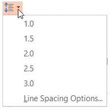 Wrong Line Spacing Tool
This leads to the following result:
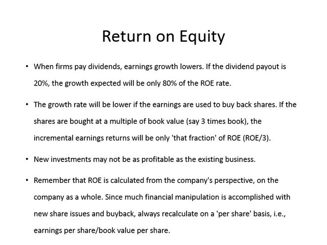 Slide With Wrong Line Spacing
The preset options add equal spacing between all the lines in the paragraph. Though the space between lines makes it easy to read the text, the individual points are not clearly distinct.
A better option is to click on the ‘Line spacing option’ at the bottom of the menu. This opens up a dialog box. Change the line spacing to ‘Multiple’. Add a value of 1.2 or 1.3 instead of the usual 0.7. This increases the space between lines.
Under ‘Spacing’ option go to ‘After’ and increase the value to 12 pt. This places a distance of 12pt between successive bullet points.
The following screenshot shows these steps:
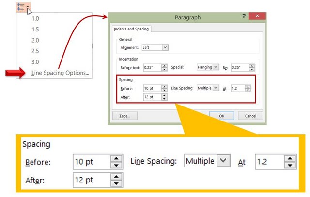 PowerPoint Tool for Line Spacing
When lines have distance between them and individual points are clearly distinct, the look of the slide improves significantly as shown below:
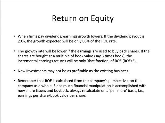 Slide with correct line spacing
Here is a ‘Before – After’ view of the slides:
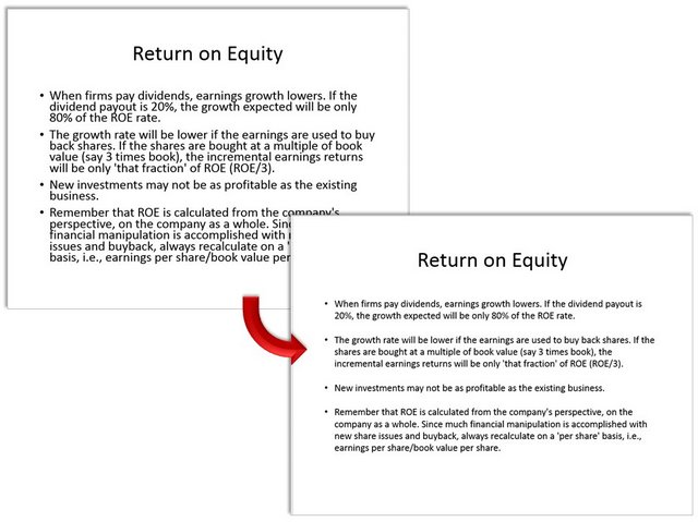 Before and after using line spacing
Improve quoted text with line spacing:
Let us say you need to quote a couple of paragraphs from a book. Here is how the slide looks:
 Wrong line spacing for quote
The slide doesn’t look too impressive. There is empty space around the text. Lines are packed too tightly and the two paragraphs are sticking to each other.
To improve the slide, increase the line spacing to 1.2 and add 12pt after each paragraph.
 Line Spacing setting
Add an indentation at the beginning of each paragraph by clicking on ‘Tab’ button on your keyboard. The result is as follows:
 Quote with correct line breaks
Here is a ‘Before – After’ comparison of the slides:
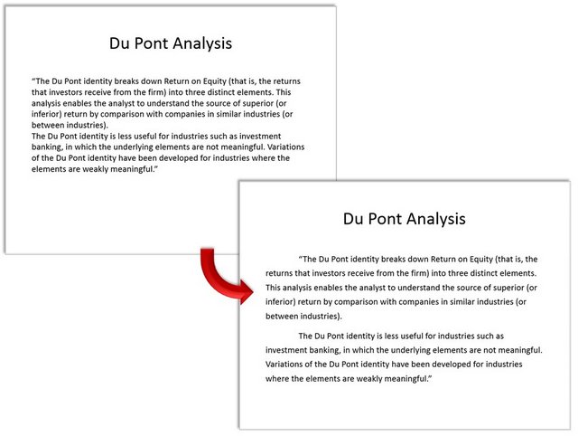 Before after comparison of quote slide
It is such small attention to details that makes a difference between average slides and professional looking slides.
Another way to impress your audience:
Knowing how to use line spacing to your advantage helps you create business slides that impress your audience. Another way to impress your audience is to use high quality graphics and diagrams to your slides. However, it takes a lot of time and effort to create high quality graphics from scratch.
That is why we came up with our All Inclusive PowerPoint templates collection for busy business presenters like you. Just choose the template that matches your thought and replace the sample text with your own text. Your business slides get ready in no time. Creating professional quality business slides has never been easier.
Why waste time creating your graphics and diagrams from scratch when you have such high quality solutions available off the shelf? Please browse through our diagram templates collection and see how our templates can change the way you create your business presentations forever.
Related Posts
Main PowerPoint Tutorials Page
