Find PowerPoint Design Elements
Do you know that there are some hidden PowerPoint Design Elements you can reuse to make your presentations look remarkable? They are hidden in Design theme sets that come as part of PowerPoint. Most presenters have no idea how to isolate and reuse these elements from the design themes.
1. Hidden Textures in PowerPoint 2013:
How would you like the following wall texture to use in your business presentations?
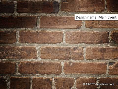
You can use the wall to show the concept of a barrier, or as a design element as part of your own design.
How would you like the following perforated metallic sheet texture to use on your slides?
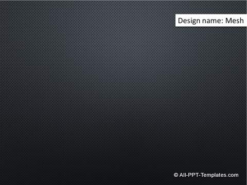
These are available as part of the design
theme sets in PowerPoint. The theme from which the element is taken is mentioned on the images.
2. Hidden Design elements in PowerPoint 2013:
Take a look at the business card design element:
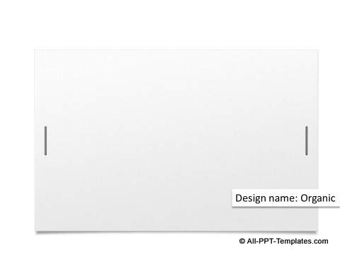
You can use this element as a simple background or to share your contact details at the end of the presentation.
Here is a nice design element to depict upward trend or turning point:
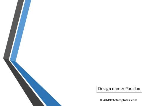
As you can see, the elements can be creatively re-purposed to design more insightful presentations.
3. Hidden Graphics in PowerPoint 2013:
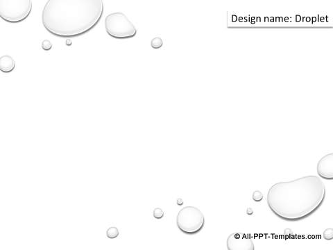
These beautiful water droplets are taken from the design theme sets:
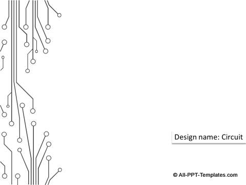
Even the following circuit design graphic is taken from a design theme in PowerPoint:
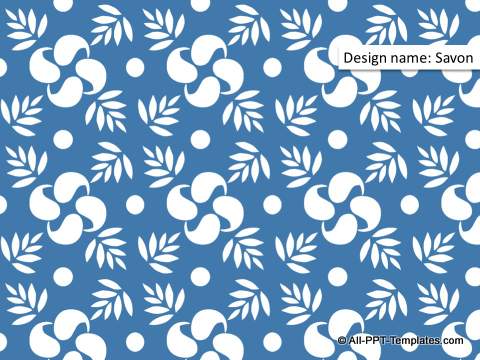
When you want to add some flowery pattern to your slides, you need not go beyond the design theme sets as shown here:
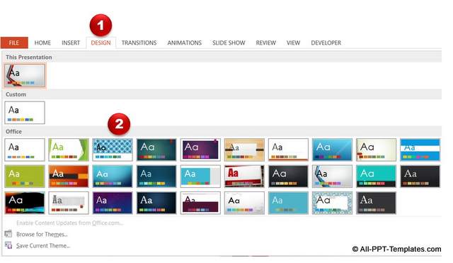
How to access these PowerPoint design elements and graphics?
Go to the ‘Design’ tab in PowerPoint ribbon. Choose one of the Design themes to apply.
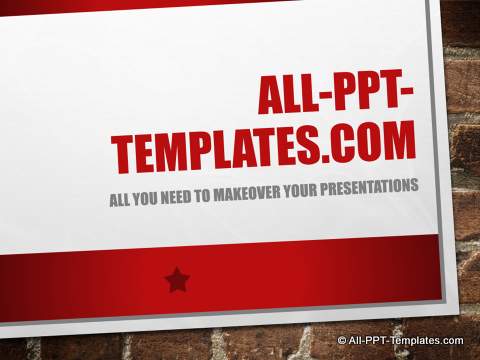
We chose to apply the following design theme titled Main Event:
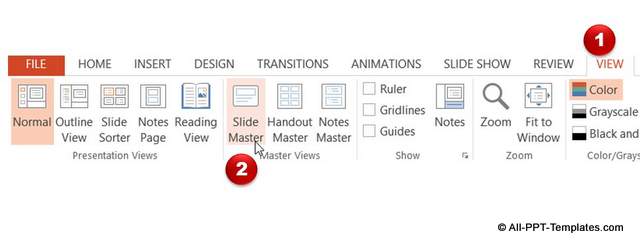
Go to View -> Slide Master as shown below:
Go the relevant slide master layout.
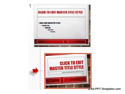
Select all the elements on the layout except the background wall texture and press ‘Delete’.
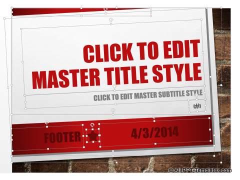
Your Wall texture is now ready to pick up.

You can copy and paste this texture shape anywhere you need. You can also use the wall texture to create some amazing 3D diagrams like this:
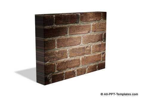
You can find interesting concepts that we have created using a wall as a concept for obstacle here. The concepts are part of the 600+ PowerPoint concepts and models pack.
Now, go ahead and explore the remaining design themes and see how we extracted the other examples we showed you in this article.
Quick Note: Playing with existing design elements is one way to spruce up your presentation. However it takes a lot of time and effort to create high quality graphics and diagrams from scratch.
Another way to impress your audience is to use relevant high-quality title backgrounds and themes based on the type of your presentation.
You will find such examples below from our PowerPoint Backgrounds themes pack. The pack has 130+ sets with matched backgrounds for title slide, content slide, section header and a color theme that business presenters can use to instantly make over their presentations.
You can find out more about these templates and browse the contents of the pack here.
Examples of Ready To Use PowerPoint Business Themes
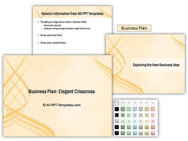
1. Business Plan Theme:
In the following example template uses the simple design to present a business plan. The set contains background for title, section header, content layout and an appropriate professional color theme. You can add your business logo and content.
Source: Business Plans from Backgrounds Pack
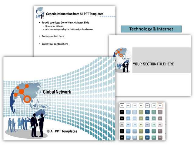
2. Internet & Technology Themes:
The following template can be used to present technology and networking related material.
Source: Internet & Technology themes from Backgrounds Pack
3. Sales Pitch Theme:
This template set is from a sales pitch theme set. It can be used to show any business idea with focus on numbers or data.
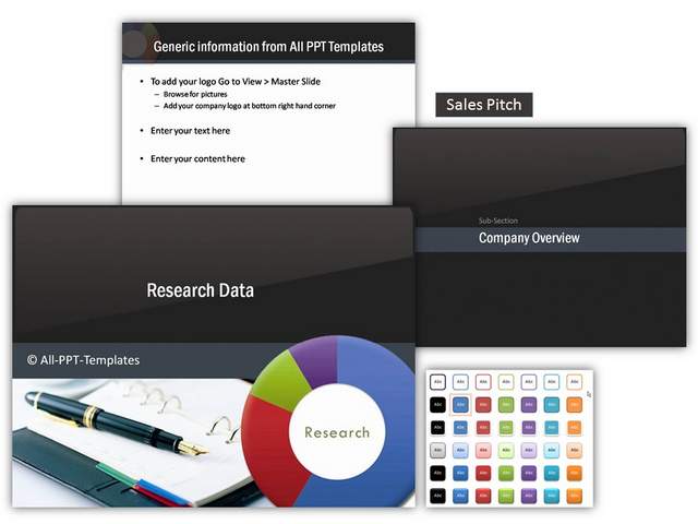
Source: Sales Pitch Themes from Backgrounds Pack
All of the above templates are taken from PowerPoint Backgrounds Pack.
If you found this article on design theme for PowerPoint useful, please do share the article with your friends or leave a comment for us below.
Related Posts
Top of Page : Hidden PowerPoint Design Elements
Main PowerPoint Tutorials Page
