How to Animate PowerPoint Chart
Data presentation is probably one of the most challenging tasks for a business presenter. In general, numbers are quite intimidating on a slide. Converting the numbers into charts makes the information easier to assimilate.
However, there are times when even charts can look overwhelming when there are too many data series to be presented. In such cases, the only way to hold viewers’ attention is to animate the chart and show information in small incremental chunks. In this article, we will learn how to animate a chart in PowerPoint 2013.
Before you animate a chart
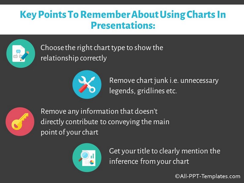
Animation is not a cure for poor data presentation. You still need to get your basics right for the chart animation to have an impact. Some of the basics are shared in this infographic below.
Once you have the basics in place, it is time to animate the chart.
Steps to animate a chart
Here is an example column chart that we will try to animate.
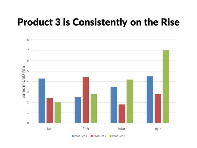
It is always a good idea to choose simple animation for charts. In our opinion, ‘Wipe’ animation works fine for pretty much all the chart types. Just ensure that the direction of the wipe is in line with the flow. For example, when you animate a column chart – let the animation wipe up. When you animate a line chart, let the animation wipe from left to right and so on.
To apply animation, click on the chart and go to the ‘Animations’ tab in PowerPoint ribbon and choose ‘Wipe’ animation. Adjust the direction of the wipe.
The animation you chose, applies to the whole chart. We need our animation to apply to individual elements inside the chart, so we can explain the chart in incremental chunks. For this, click on the ‘Animation Pane’ button to open up the pane for animation. Right click on the animation you have just applied. This opens up a menu as follows:
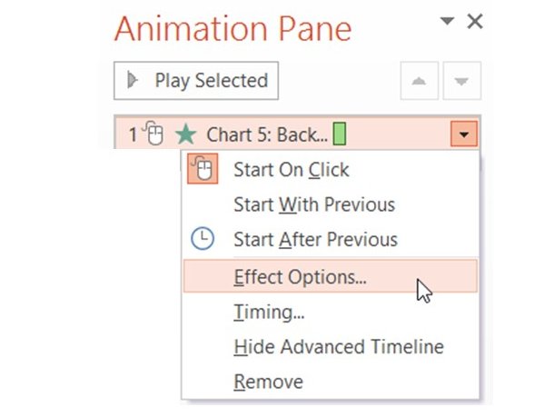 Animation Effect Options
Go to ‘Effect Options’ dialog box. Choose the ‘Chart Animation’ tab. Open the drop down list and select ‘By Series’ option.
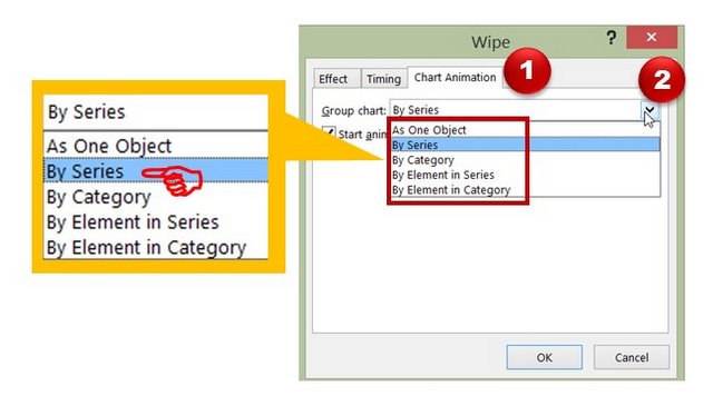
This will animate the chart by individual series which appear on click each time.
You may like : 4 Habits for Professional Design in PowerPoint
Sequence of animation:
On the first click, you will see just the axes appearing on slide.
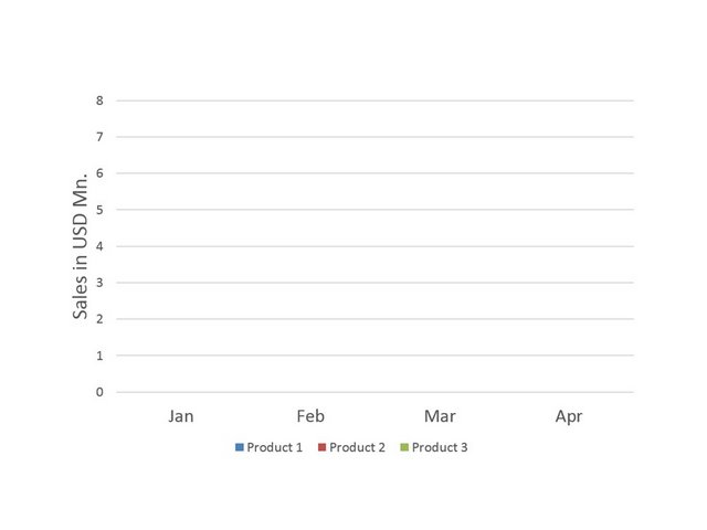
This is your opportunity to set the context by explaining the axes. Once done, you click to get the values of the first series.
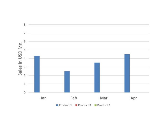
You can make your comments on the trend. On the next click, the second series gets displayed.
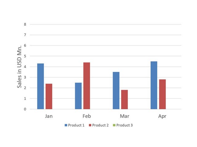
You can compare the performance with the previous series. On the final click, the last series appears, which explains the title.
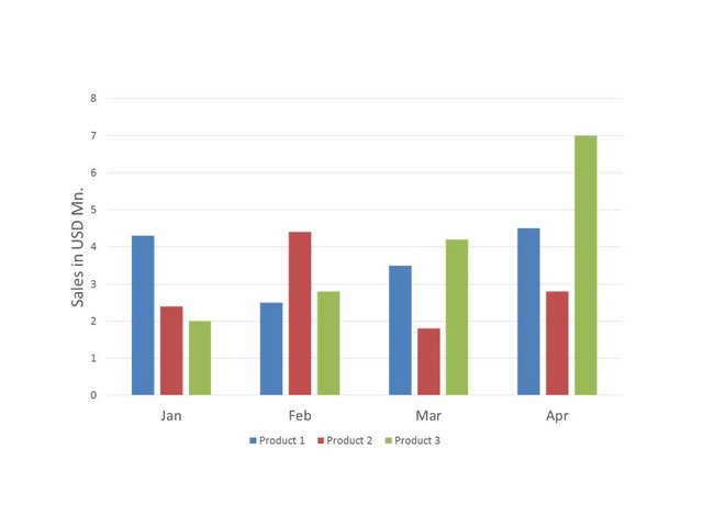
That is how you animate a chart in PowerPoint. You can see this animation in the video below:
Note: Please note that we always prefer to use line charts to portray trends on a timeline. We chose column charts in the above example for two reasons:
- Column charts are easier to explain the concept of ‘Chart animation’ to a beginner
- The number of data points were few, so we could get away with using column charts
If you'd like to know more about the right type of chart animation to select, click here.
A useful resource for business presenters:
While charts are useful for data visualization, you need diagrams and graphics for concept visualization. If you are business presenter, you may not have the time to create high quality graphics and diagrams from scratch.
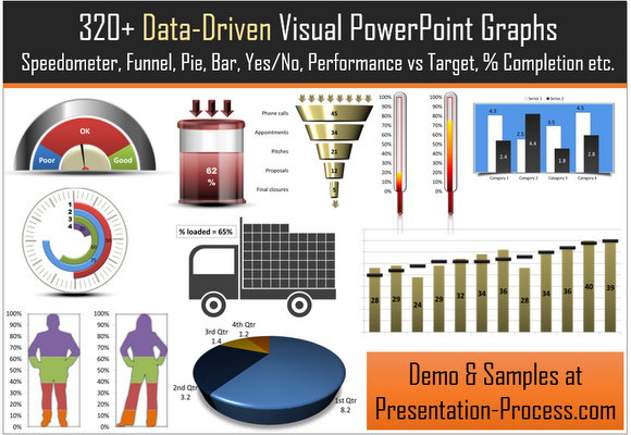
That is why we came up with our Visual PowerPoint Graphs Pack collection. The pack has 320+ editable charts. Just choose the template that suits your requirement and edit data. Your business slides get ready in no time. Creating professional quality business slides has never been easier.
Why waste time creating data-driven graphs from scratch when you have such a high quality solution available off the shelf?
Please note: The graphs pack is hosted and sold through our other site Presentation-Process.com. The contents of the pack are created completely inhouse by the same team that owns All PPT Templates.
We hope you found this article useful. If so, please share this article with your friends and leave your comments below
Related Posts
Top of Page : Animate PowerPoint Charts
Main PowerPoint Tutorials Page
